It takes a lot of data to run a city. Information has to be pulled from many sources, and it can take a lot of time and skill to bring data together and present it coherently. Sometimes data changes so rapidly that a last week’s or last month’s detailed report is not fresh enough to base today’s decision on.
Although our organisation holds a lot of data, accessing it can be challenging.
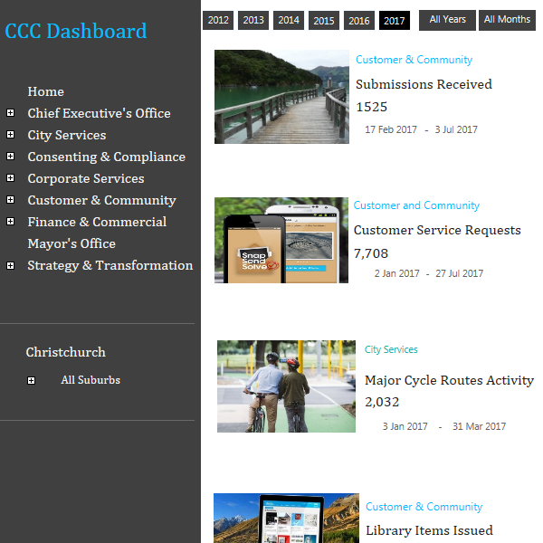
How the dashboard works
Too much data is a good problem to have. Our challenge was to work out what data was relevant, where it was kept, and how to display it in enough detail to be useful, without becoming overwhelming. The effort involved several teams and reporting experts throughout the organisation.
Examples of dashboard data include:
- Resource and building consent statistics
- Water levels and water quality
- Financial data
- Sentiment analysis from social media
- Customer centre statistics and service requests
- Monitoring of key services like rubbish collection
- Road works, road closures, and transport choices
- Usage of recreation and leisure facilities, including library and leisure centre memberships, community facility bookings, and Art Gallery and Botanic Gardens visitor numbers
Operations dashboard trial
The first version of the dashboard was released internally for feedback in March 2018. We focused on aggregating and displaying various real-time datasets from across the organisation in a variety of ways: by ward, spatial location, date comparisons across years, and so on. This trial operational dashboard went beyond simply displaying datasets, and added considerable value to the data by applying analytics.
Results of the trial
- Users reported insights from seeing the data presented simply and visually in one place, and being able to compare datasets at a glance.
- Users were getting new insights from the visualisations of their data in the first few minutes of looking at the dashboard.
- Displaying the data visually helped users to see previously unseen discrepancies. This is an expected and very useful outcome when data is exposed.
- Both users and managers could see the advantage of understanding performance based on the latest real-time data rather than monthly reports.
What’s next?
Our internal Business Intelligence Reporting team is keen to pick this initiative up and develop the dashboard further.
The next step is to create a browser-based version of the dashboard, so staff, managers, and elected members can access it at any time, from any location.
Later this year we will begin to include information from partner agencies such as Environment Canterbury, the Canterbury District Health Board, and private sector partners such as Citycare and Orion. By combining relevant data across agencies and sectors, we can see links and patterns that aren’t obvious when looking at Council data alone, and identify potential problems and opportunities earlier. For example, we might use long-range forecasts from the Meteorological Service, along with water level data from reservoirs and aquifers, to decide whether to set water restrictions during summer heat waves.